January was awesome for us all, we started a new year well! Most of us with Sophie Ellis-Bextor, but also, we started it with a fresh new slate of mock-creators showing us their creativity holds no bounds!
Every so often, the world of fictional branding gets a fresh injection of creativity, proving that sometimes, the best designs don’t come from corporate boardrooms (like most things, because what the fuck was BBC Three's hands thing) but from the minds of dedicated designers, artists, and branding enthusiasts. January 2025 saw some truly outstanding mock rebrands within the QLMB server - visions that took existing brands and twisted them into something new; we are talking completely outside-the-box thinking. Among the standout projects and/or one-off makings of the month, three stood above the rest. The bold reinvention of a classic gaming channel, an Irish broadcaster, and an iconic comedy network receiving the facelift of the decade, these fictional rebrands weren’t just good, they were (hand on heart) better than the real thing! So, with no time wasted, let's get into the top 3 mocks of January 2025!
[PS: To be on this list, you must make a rebrand project, not just a one-off mock!]
2. RTÉ – Conor
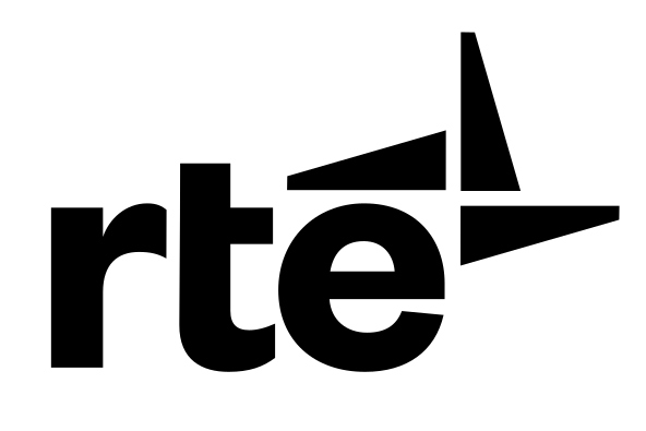
For years, Ireland’s RTÉ (Raidió Teilifís Éireann; a mouthful if you aren't irish) has suffered from an outdated and inconsistent brand identity... for over 10 years. While the network remains an institution in Irish media, its visual presentation has struggled to keep pace with any of its European, or England counterparts. That’s where Conor’s mock rebrand comes in — a bold, sophisticated reinvention of RTÉ that gives the broadcaster the gravitas it deserves; one symbol, a rainbow of colours. Conor’s design philosophy for this project was simple: elevate, streamline, and unify. The outdated serif-heavy logotype? Gone. In its place, a refined wordmark and simple, distinct pinwheel-esque icon that feels timeless yet undeniably modern, with subtle nods to design language heritage. But what truly sets this rebrand apart is the rich colour palette across every bit of RTÉ branding — a rich blend of deep greens, navy blues, and gold accents, some outlined, some not, evoking Ireland’s cultural roots while steering clear of the cliche basic imagery that, tragically, is a bad pithole that so many rebrands fall victim to.
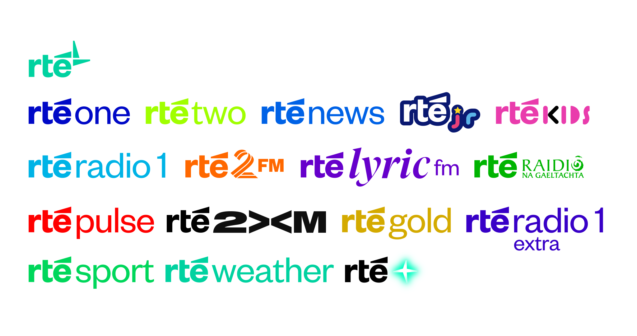
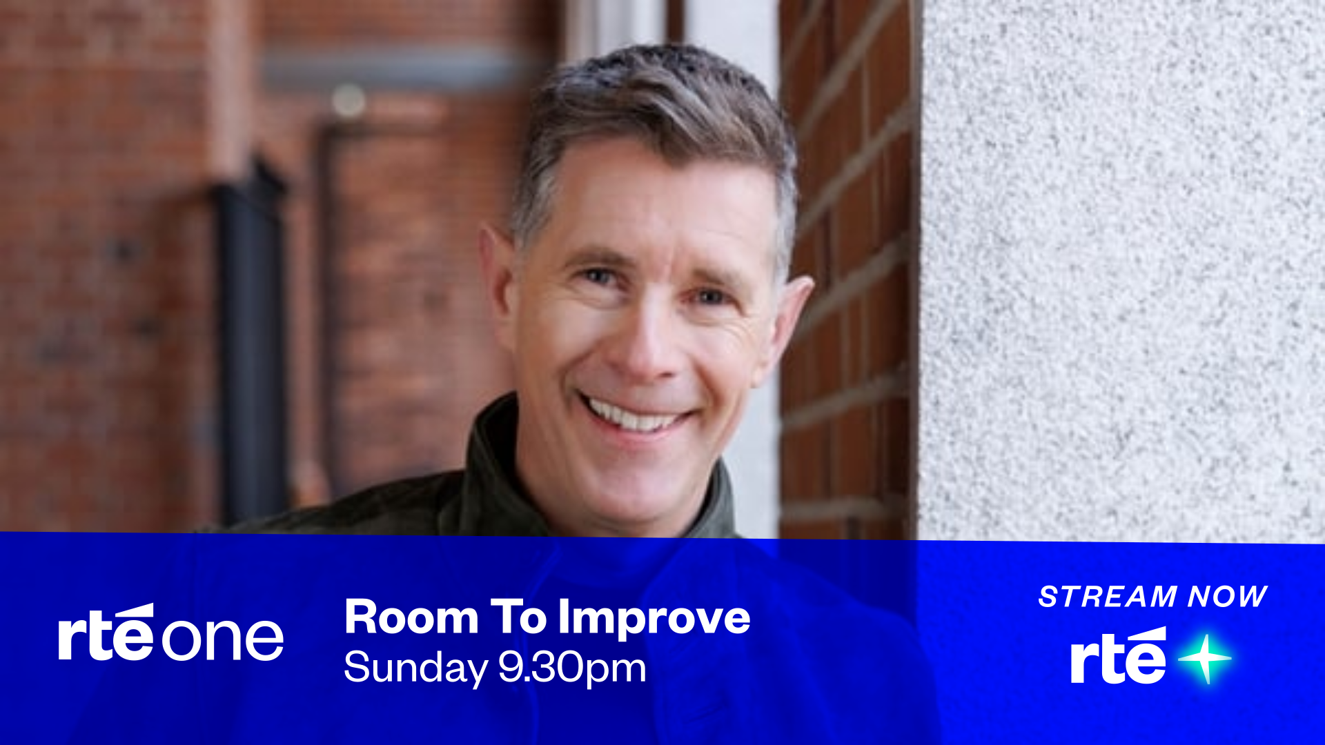
The package extends far beyond just a logo. A full suite of on-air ident assets accompany the redesign, with Conor envisioning a sleek "perspective"-type ident package for the main channel, and we can only imagine the fluid transitions and seamless lower-thirds that Conor would impose across RTÉ’s multiple platforms. Whether it’s news, entertainment, or sports, this rebrand proves that RTÉ could, and should, be a leader in broadcasting design. It’s the kind of visual overhaul the actual RTÉ has needed for years, and quite frankly, if the real big boss execs were paying attention, they’d be smart to steal this concept immediately. Conor had this to say:
"Omg, wow I didn't expect none of this! I'd like to say thank you all for liking my rebrand, even though I made all the logos on Inkscape. I'd send it all to RTÉ but they prefer pros compared to an average designer like me. Again thank you all so much for put my design in the number 2 spot!"
1. Comedy Central – Tyler Lastname
When a network as iconic as Comedy Central undergoes a major rebrand, it has to strike a careful balance of staying true to its comedic roots while feeling fresh and forward-thinking. That's more than tough. However, in a close neck-to-neck race of reimagination, it was the idea of Tyler Lastname’s reimagining of the channel that achieves exactly that, a masterclass in brand evolution. It's that type of branding that Greta Thunberg would love to talk about; reuse, recycle. If you can't knock it, then don't change it! Comedy Central’s real-world branding has gone through multiple iterations over the years, from the wacky cartoonish designs of the early 2000s to the ultra-minimalist and "multiple graphics of C's" direction of the 2010s. But Tyler’s vision takes the best elements from every era, crafting something that feels both instantly recognizable and brand new.
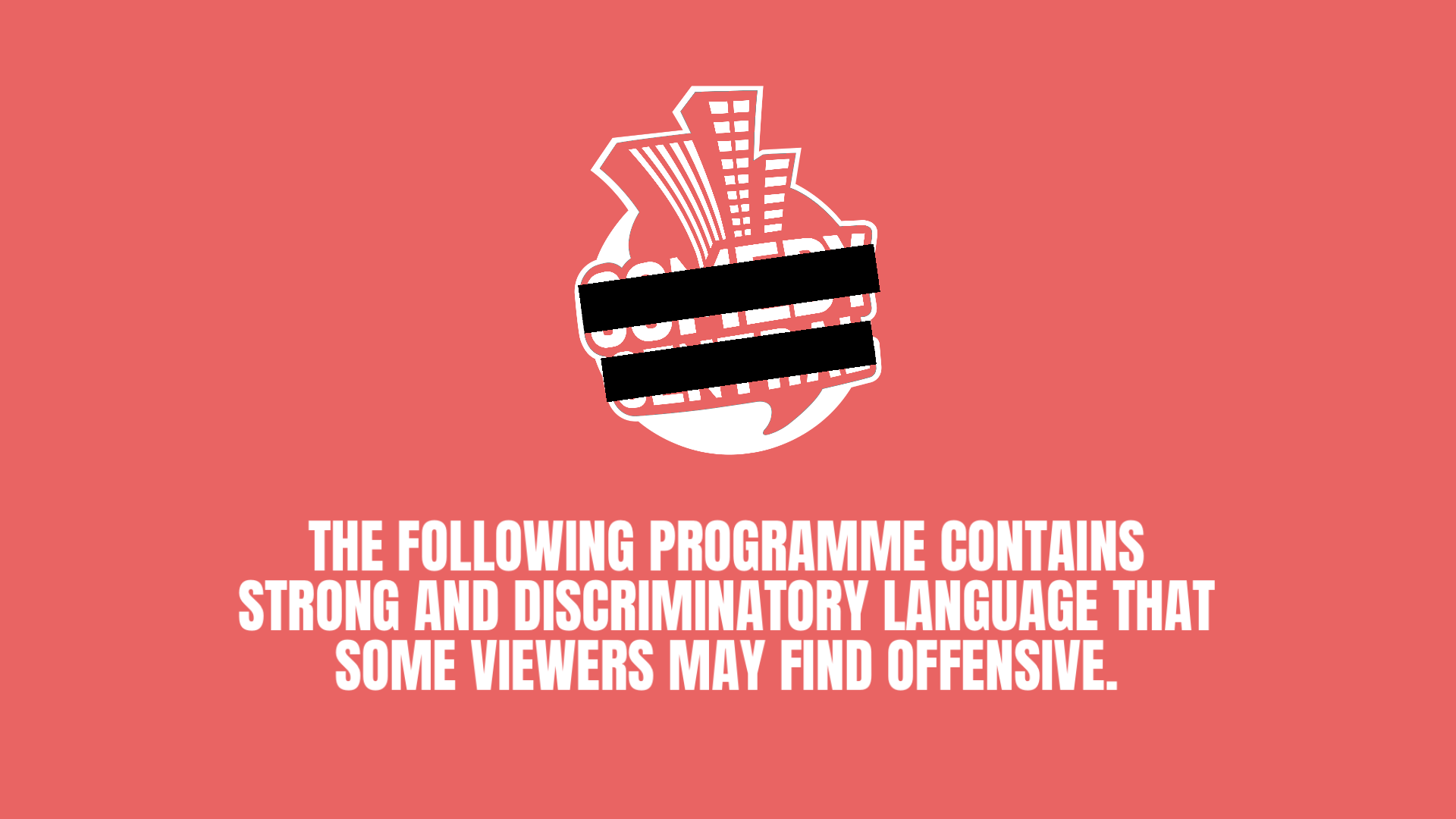
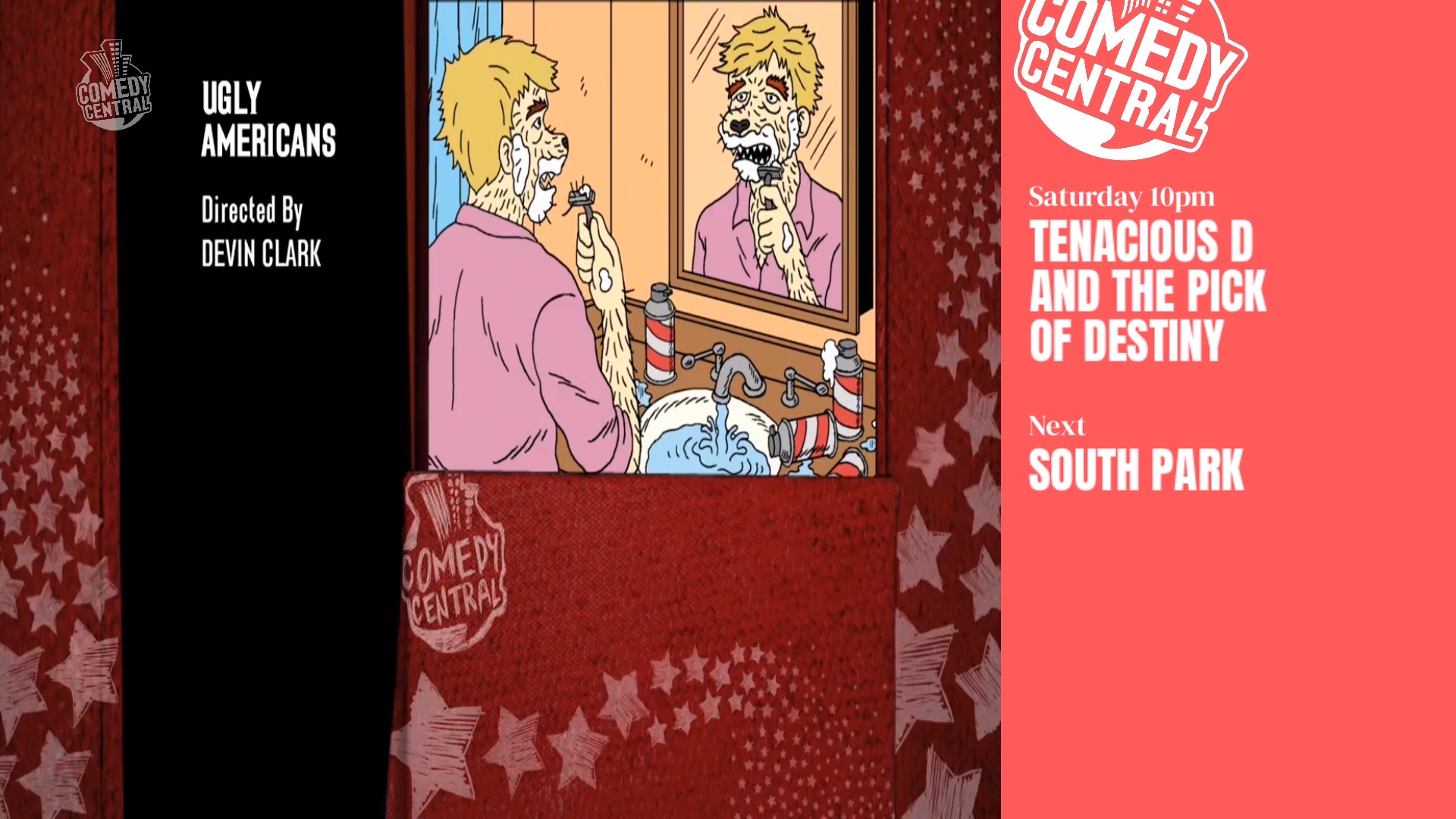
The logo is the same 2000s look, what was a brilliant fusion of playfulness and professionalism. But rather than the sterile duotone look of the previous Comedy Central branding, Tyler injects a vibrant, busting colour that bold primary colours and offset typography could never do; BABY. PINK. Perhaps the most impressive aspect of the rebrand is its simplicity. Tyler’s vision includes meta-textual, out-of-the-ordinary postioning of the logo, where all the text does all the talking, and standout boldly. The entire package embraces self-aware space, perfectly aligning with the network’s irreverent spirit of comedic timing in a (as far as we know) non-purposeful way.
It’s a brand identity that doesn’t just support the content! It is part of the joke, promoting recognisability by the audience subtly filling in the rest of the logo, no matter where its cropped. And in an era where streaming services and culture dominate entertainment, this mock rebrand proves that Comedy Central could reclaim its throne as the home for comedy with the right visual direction... and keeping the same logo! We got to caught up with Tyler to celebrate his crowning!
"The reason i made this is because i thought Comedy Central didn’t need to change their logo, the one they had in 00s could work now. It was all just boredom really. Didn’t know it could lead to a number one placement so from the bottom of my heart, thank you ever so much. Thats all ig, stay cool ❤️"
What a month!
January 2025 showed us that fictional branding is a statement on what these companies and channels could be doing better. From Conor’s RTÉ overhaul, showing how legacy broadcasters can still look fresh, and finally, Tyler’s Comedy Central evolution, proving that new isn't always better in of itself, these projects are more than just "what-ifs" as they truly are blueprints for better branding, and if history has taught us anything, it’s that some of the best ideas start out as mocks before becoming reality.